Thursday, 17 March 2016

OUGD502 / STUDIO BRIEF 02 / PROMO PACK RESEARCH

Upon looking at Behance I came across some really creative ways of demonstrating skills and designers talking about themselves.


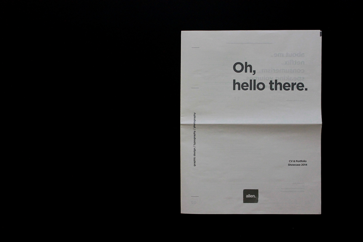
This is a promotional pack containing the identity of Charlotte Allen. This contained a CV and a portfolio in one, which is a really good way of combining the two in one succinct publication. This makes it easier for the client to read and is something professional to keep. Presentation as a designer is everything so it is important to always demonstrate the skills that make you stand out from the rest.

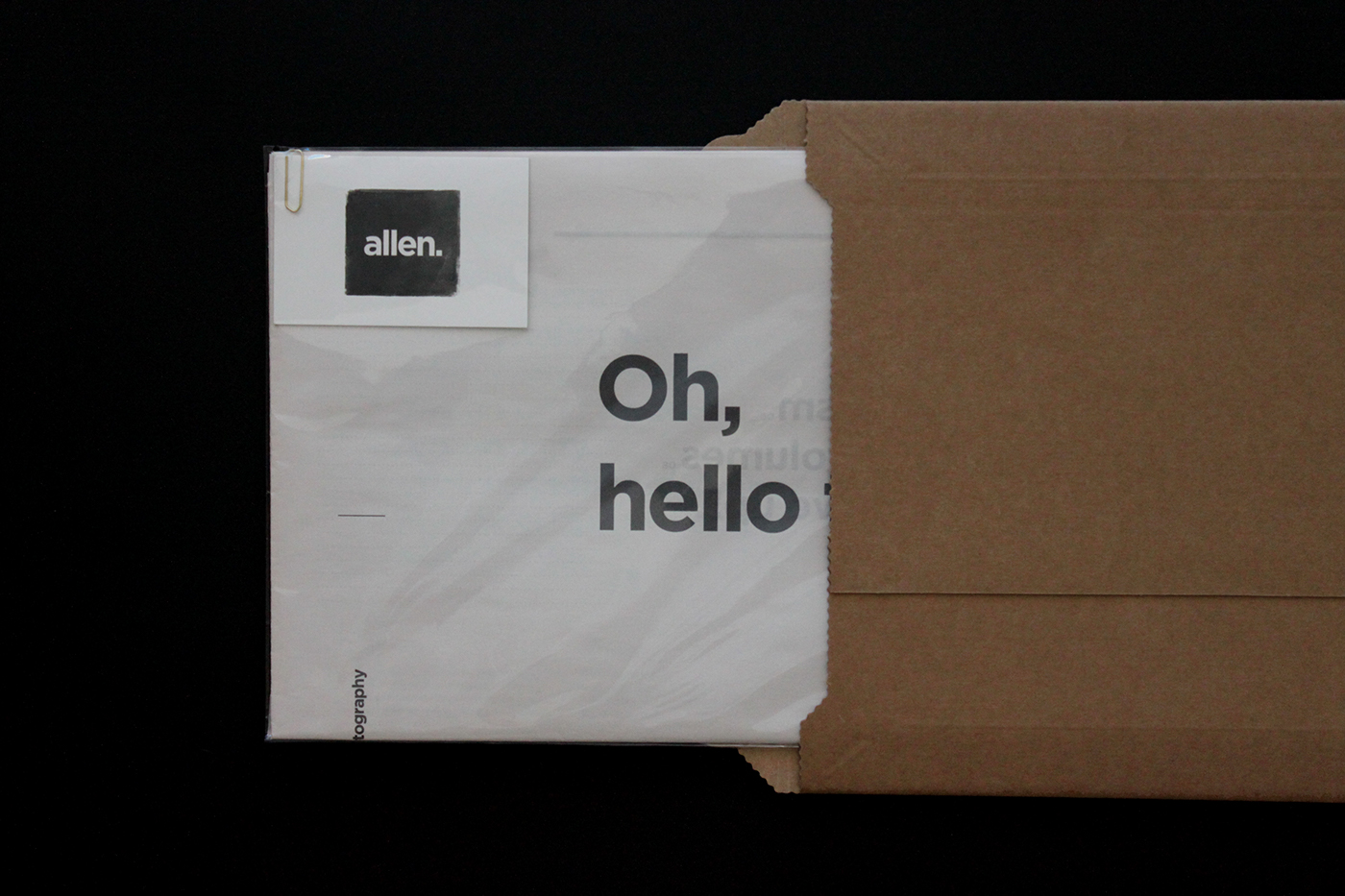
I liked the eco friendly look of Allen's CV, especially with the hand printed feel of her logo alongside the brown envelope. The envelope is the first thing that will be seen, so it needs to impress from word go.


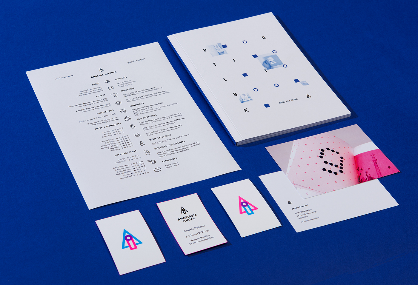
The continuity in this branding is what makes it stand out (alongside the eyewateringly bright green). It is important to give your self branding consistency to really enforce your identity and who you are, so you can become as recognisable as possible.


Another concept based brand identity which stood out to me during research. The portfolio looks extremely professional, which is something I am aiming to implement in my own work. As I plan to make the discourse quite informal within my CV/promo pack, I think the overall aesthetic should reflect my professional side to create a nice juxtaposition between my common northern personality and my love and passion for great design. 

OUGD502 / TAKING CARE OF BUSINESS FEEDBACK

Feedback was emailed back to us regarding our Bodies presentation:

"A ‘quarterly’ student publication and associated blog to showcase student
offerings and works to their peers and beyond.

A somewhat similar offering to ‘ISSUE’ but with additional offerings potentials such as workshops, visits and presentations. This has potential as an offering in subscription terms. The question of whether students would pay £14 per issue is 
not really important, one can offer student discounts and subscription terms as these will potentially guarantee an income of some sort (which is a good planning tool for development).

As I mentioned on the day, if you are producing short runs, it gives the opportunity to utilise the ‘limited edition’ effect and the collectible value potential too.

When presenting work, it is really important to spell check your slides as in future, clients will feel a little less comfortable that if handling their work, you are
potentially going to spell things incorrectly and transferring the ‘sloppiness’ to them? 
Well done and you can build on this if you feel like it?

Blog all the feedback and try to rationalise what you thought of this project, helpful. informative or too business  oriented?

We should be having Alec Dudson from Intern Magazine coming in this semester and that might be of particular interest to you all."

The feedback was very helpful and addressed issues that can be worked on should I work on anything similar in the future. 

The project overall was very informative and gave me a feel of how it would be to start up a business from scratch. There is a lot to think about when creating a new business, and having 3 extra heads was beneficial as we all assigned each other responsibilities which lessened the work load. Overall I enjoyed this project and it ended up becoming a resolution that I was proud of and interested in, which I feel would be successful if it became real.

OUGD502 / STUDIO BRIEF 01 / ANORAK

I attended a talk made by the creator of Anorak magazine, Cathy Olmedillas. I am interested in anything editorial so this was a good opportunity to gain some knowledge. Anorak is a well established children's magazine, founded in 2006, which is very illustration based. I enjoy Anorak's overall aesthetic and feel as though this is appropriate for their target audience. I personally do enjoy illustration when I get the time to do it, and so I found the talk very inspiring. I also like any project which delivers a real sense of enjoyment and fun.

Cathy was extremely passionate about Anorak magazine, which is why I feel it has gained so much success over the years. A project without passion cannot thrive.


Cathy has also branched out further, and created Dot magazine. She felt Anorak was only  suitable for older children and excluded those of a younger age. This just shows the dedication in expanding on an already successful magazine and choosing to try and include a wider audience. 

Wednesday, 16 March 2016

OUGD502 / STUDIO BRIEF 01 / PROJECT EVALUATION

During the course of this project, I have become more aware of existing industry professionals in cities within the UK as well as those outside which has introduced an increased level of ambition and aspiration for my future. Seeing established industry professionals and developed studios has allowed me to set goals for myself and my practice, and inspired me further to push my evolution as a young graphic designer. I realised the importance of gaining exposure and communicating with other creatives, and the benefits of building a successful rapport. 

Choosing who to base my creative report on was too difficult as I had progressively became aware of professionals through using social media, however conducting the questions and eventually contacting Tyler was daunting incase I was met with no reply. In order to ensure success, emailing and contacting multiple individuals proved to be effective, and built up my confidence in communicating with other designers professionally. Tyler Spangler omits a very overt sense of fun and spontaneity which I feel is a strong part of my own practice. I like to always maintain a sense of fun within my design, and try not to take myself too seriously. Enjoying a brief is a recipe for success, and even though I recognise that concept is key, and research is a highly important area of the design process, sometimes just doing something for the fun of it is immensely appealing. Tyler was overall very friendly and this brief allowed me to make a connection with a designer I’ve personally admired for over a year. It is inspiring to see designers take the time to reply to young designers, as I have experienced within the brief with Tyler Spangler, Wayne Daley and Sam & Kaeli Wood from Both studio; each response gave me something different and useful to take away into my own developing practice.

Alongside this, attending talks by Anorak and Teal Triggs again inspired me. It is great to see an idea like Anorak form into something spectacular and successful. Attending the talk by Teal Triggs was especially interesting for me as the topic of women’s self publishing and feminism is important to me, and gave me a lot of insight and help for other briefs in different modules, proving that the course is broad, and skills and knowledge can be transferred between modules.


This project has simply been very enjoyable for me, as I felt I had a lot of creative freedom which is something I thrive on. I enjoy editorial design over any other discipline within graphic design, so being able to further develop my skills in this particular practice was helpful and satisfying, and in regards to what I produced, I am very pleased with the final resolution. I managed to combine a contemporary style that I am currently interested in, with Tyler Spangler’s unique work, in order to create something that encapsulated him, but also expressed my own style of working too. 

OUGD502 / STUDIO BRIEF 01 / TEAL TRIGGS

In order to gain knowledge and further understanding for mine and Jack's Telegraph brief,  we were told that a talk by Teal Triggs, a professor at the RCA, would be useful. The talk was in reference to women and self publishing, particularly the development of independent feminist zines throughout the 70s-90s. There was a clear theme throughout a lot of the fan zines, of aggression which promoted the new wave feminist movement. Women then were understandably tired and frustrated because of the situations they were in, and the inequality they faced, and obviously their anger was channelled through creative publishing.

Zines such as Riot Grrrl, girl is transformed to 'grrrl' to represent a phonetic growling noise linked to anger in the animal kingdom, and Vaginal Teeth - referring to the vagina as an animal that can cause damage, all present women in a very aggressive and radical tone, which could have been the most effective way of gaining publicity and a voice back then, and an alternative method of bringing a particular community together.

A lot of the zines featured hand rendered elements, including the humanisation regarding hand lettering. This was because zines were commonly done by hand, then copies were made and distributed.

I found this talk particularly interesting to me because of my consistant passion for feminism, plus I have my own experience with feminist zines myself. It was great to see the alternative methods used to connect people and bring about change, and Teal Triggs delivered a very engaging talk which is what you would expect from a professional. It would be amazing to actually show her my own zine and get her opinion in the future.

OUGD502 / STUDIO BRIEF 02 / DISTRIBUTION

In order to get my work out there, I would send the promotional pack out to potential studios or clients, in hopes of acquiring work and experience. The types of places I would send these to would ideally be contemporary studios around Manchester, Leeds and London, but I would also love to send work to studios in other countries - eventually I would really like to get an internship or work opportunity in a country such as Berlin, where there is a lot of opportunity regarding design. 


The most realistic aspiration right now is to gain experience over Summer in London, Leeds or Manchester by sending out my promotional pack or sending a lot of emails! I'd also like to try and email studios in Berlin (even if it is a long shot) and see where that gets me. Even having a chat with studios there would be beneficial to me and my practice, as I am always keen to evolve as a designer whenever possible. 

OUGD502 / STUDIO BRIEF 02 / WHY A PROMO PACK?

The reason I chose to create a promotional pack was to basically show off design skills to potential clients and work opportunities. Instead of only recieving a business card, they will recieve a card, print and a copy of my creative CV. 

The field of graphic design I am most interested in is editorial design, ideally working on magazines in particular, although potentially just any form of publication is where I see myself in the future. In order to demonstrate the skills I have acquired in this field, I felt  that a creative CV would be the most appropriate. In the end I had a lot of fun with it, and since it is all about myself, created it exactly how I wanted it; having a lot of creative freedom is liberating. 

The print is also a way of communicating my personality which is consistent with my branding. 

For the promotional pack, I chose to package it using special matte black bubbled envelopes. The envelope is the first thing they will see, so I wanted to impress them initially by using something perhaps a little different. These envelopes are also very durable, meaning my promotional pack would avoid damage during postage. 


On the front of the envelope, I chose to print out stickers  with my logo on, further reinforcing my branding from the very beginning and also aiming to look as professional as I can. 


Monday, 14 March 2016

OUGD502 / STUDIO BRIEF 01 / CREATIVE REPORT - WHAT I LEARNED

During the report, I learned more about Tyler's outlook on life and design, which reinforced a work ethic that I already take, by keeping my work fun, it becomes more enjoyable. If I am not having fun with a brief, it seems quite pointless to me. Tyler demonstrated that he has not always wanted to be a designer, although creative, at one point he was on track to become a Psychologist, and has a degree in this field. His experiences prove that sometimes you are not on the right path, and it may take something for you to realise this until you can discover what you are supposed to be doing and what makes you happy. 

Tyler showed me that sometimes it is alright not to be too serious and to not get too wrapped up in work, take a breather and have some fun with it. I tried to encapsulate this outlook in my response to this brief, by creating a publication that educated the reader about Tyler Spangler, showed his work and also communicated a sense of fun and vibrancy that some designers sometimes lack. 

OUGD502 / STUDIO BRIEF 01 / CREATIVE REPORT - IDEAS

Upon thinking of ways to convey the creative report, I came up with the idea of setting out the interview using instant message chat bubbles. We live in a digital age which is very instant and technology based; everyone has a phone and everyone messages their friends this way for convenience and efficiency, personally I don't think the advances in technology for social uses is a bad thing, if anything we are becoming more social but in a different way.

If the messages are in chat bubbles, the audience can relate to this, as it is modern and fun, encapsulating the most popular way to communicate via internet and text messaging. This is also the means of communication I chose to ask Tyler Spangler the interview questions, as he lives in California, it would be impossible to meet in person, and I wanted an instant way to message him quickly, therefore choosing instant messaging. 

This method in my case has been successful, however it did not allow me to talk to him directly. Personally, this did not effect my creative report, and the answers he provided where just as knowledgable than if they had been said to me in real life. 

The publication will contain chat bubbles of the interview alongside information about Tyler to give some background, examples of his work and also my own experience with talking to him and what I have gained from the experience. Hopefully I will be able to captivate an audience using specific design principles such as colour, type and imagery, and also tone of voice. It all must be appropriate to how I have handled the interview and should be done with Tyler's design style in mind. 

OUGD502 / STUDIO BRIEF 01 / QUESTIONS

The questions I wanted to ask Tyler were short and sweet, and I tried to ask quite 'fun' questions too. I did not want to bore Tyler with standard questions however I knew it would be foolish not to try and gain some tips and knowledge regarding design of course. I created a happy medium by basing these questions on parts of his life and also a fun question to break the ice, 'what's your favourite animal?'

Tyler was considerate enough to take the time to answer my questions promptly, using Facebook as our means of communication. I felt as though an email could get lost, however contacting him on his Facebook page was more direct and friendly, however less professional. I wanted this creative report to turn out fun and relaxed rather than too serious and 'corporate'. 

What is your favourite animal?
My dog Patch. He is a one eyed terrier mix. He just has so much energy and is always in such a spunky mood.

What influenced your creative style?
I think it was a combination of: horror movies, surfing, video games, George Carlin, Electric Wizard, candy, Wolfgang Weingart, Baldessari, Ozzie Wright, among others. 

What drove you away from Psychology and towards a creative field?
While I loved learning about Psychology, I couldnt see myself listening to peoples problems and directing their life. It seemed very depressing. I always loved creating things and I would rather effect peoples lives through art instead of advice. 

What is your personal favourite piece of work to date?
I honestly dont have one. I look at my entire catalog as one continuous piece.

Did owning a punk venue inspire any of your designs?
I think that experience was an ingredient among many others that influence everything I do. 

How would you present the content of this interview if you was in my position? 

I would print out your 10 favorite pieces and tile them on the wall of your classroom. The more the merrier.


Now, I must take these questions and use them creatively. My main area of interest is editorial, therefore a publication is the most appealing idea at the moment. I feel it will be the most suitable method of laying out the information I have, even though there is not a large amount of text. I must think of a short and snappy concept which is appropriate to how I have communicated with Tyler and which sums up his personality and work. 

OUGD502 / STUDIO BRIEF 01 / D&AD TELEGRAPH

Prior to this brief I had never worked creatively on an application, the only form of UX / web design I had experienced was part of Design Production, brief 4. So choosing to work on the Telegraph brief was daunting but eventually rewarding. 

For this brief I chose to work with Jack, as it is part of the collaborative brief for the Responsive module. This was great as there was a lot of extensive work to be done, and Jack's knowledge of After Effects was exceptionally useful, as for the submission we decided to animate our design, which was a news app called Your Telegraph.

However I was challenged by this brief which is a positive to any brief - you always need to learn and grow as a designer and gain more skills. I feel prior to this brief I have not had to work in such a serious and professional way, and usually base my design on fun, art and spontaneity. This work had to be completed whilst continuously thinking about the user and their journey throughout using the application.

I feel as though it allowed me to expand my knowledge as a designer, and as I settled into the brief I began to enjoy it a lot more, for example creating the profile page and the article pages, however I'm unsure if I would strive to persue UX/UI in the future.


OUGD502 / STUDIO BRIEF 01 / POLSKA

During Design Production, we completed a brief entitled "Type in Context", which enabled us to use the images collated during the Summer break of an alphabet of type in a publication. This brief, although fairly specific, gave me a lot of creative freedom. I chose to create a publication displaying my favourite examples of type I found on my trip to Poland, alongside some impactful photography.

This brief has stood out to me as it was the brief which made me realise how much I enjoy editorial design, and pushed me to want to do this as part of my career. I have always been interested in books and publications, especially the way magazines are layed out, and this just confirmed that this would be an ideal focus for my own practice.

What I most enjoyed about creating this publication was how involved I was, it was my photography and my layout, and it gave me a nice sense of achievement to see it in it's finished format. I felt inspired to create more personal projects involving publications in the future, for example I would particularly love to have one of my works featured in a place such as Village bookshop, or an establishment similar to it.


OUGD502 / STUDIO BRIEF 01 / ATOMIC PUSSY - FEMINIST ZINE

This year, me and Charlotte continued the progress from last year with our feminist zine Atomic Pussy. We tried to develop it in a more contemporary way for this issue rather than using hand rendered elements. The articles were written by people who are interested in feminism who follow our Zine's twitter page. They submitted work via email. There was a range of responses including articles about female genital mutilation by Kate Powell, alongside colourism and sexualisation.

Members in our class also submitted work, including Cameron's article on fluidity and a design focussing on India's rape culture by Jack.

Although I am happy with how the zine turned out, this was created mainly during Summer and I feel I have progressed a lot as a designer since then, therefore if I should design for the next issue, I would do a lot of things differently, including typesetting and planning beforehand.

Another issue is the name of the zine which we have grown dissatisfied with, and feel it could be catchier and more fitting to a wider audience. Although controversial, we felt the name could hinder our chances of gaining a bigger audience for it, and may put people off. We would not want to lose the controversial nature, but feel it could be done in a more subtle way.


Friday, 4 March 2016

OUGD502 / STUDIO BRIEF 01 / LEVEL 4 REFLECTION

I thought it would be beneficial to look over some of my work ethic from last year and compare it with how I have progressed in level 5.

Upon entering the course I had barely any knowledge of graphic design, I had simply come from doing art for many years throughout my previous education, and this was the foundation of my creativity, graphic design was my 'hobby', and I certainly had not had the experience that some of my peers had, using graphic design in more of a context rather than creating things just because I could, for 'fun'.

I learned quickly on the course that swiss graphics were extremely common amongst those around me, which initially intimidated me as I had not really discovered this in depth or particularly warmed to the style of it, at this point I simply wanted to draw/paint and use ink in all my work to express my fine art side that I had left behind after a levels.

At first I tried to 'fit in' with modernist graphics, but at the time this didn't feel very true to me, or my 'style' at this point on the course. I began to try and interject analogue techniques and found a happy medium of digitalising brush strokes, illustrations and other mark making. At the time I felt as though this was my style, however it became a regular occurrence that I would rely on hand rendered design even when it was not as appropriate, as it had become comfortable and routinely.

Over Summer, I discovered how much I actually appreciated contemporary design, through browsing websites such as tumblr, trendlist and pinterest, I found a newfound love for this type of design, and took inspiration and tried to fit this to my own practice with my personal projects. I had been working on my Feminist zine, and for this issue I had began to apply contemporary principles to it, which was a great way of refreshing the way zines are approached, instead of the messy hand rendered style, we had created a contemporary, clean zine which still communicated a passionate message.

Throughout my progress in Level 5, I have refined my style, still keeping it dark in places, but applying contemporary principles and not limiting myself to hand rendered techniques. This was really liberating and fun for my own practice as I no longer felt defined by using ink!

OUGD502 / STUDIO BRIEF 01 / WAYNE DALY

I came across Wayne's work whilst looking for contemporary graphic designers concerning themselves with print, who happened to be from the UK.

From Wayne's website, it is easy to see his various experiences and achievements over his career, which is impressive. Since he had a lot of achievements spanning a decent amount of time, I wanted to ask him a few questions which could work for my creative report.

His answers were very interesting for me, and reminded me of a valuable way of living - only concerning yourself with the present. Focusing on the past and the future too much can only cloud your thoughts about today, and what is in the now. Wayne clearly lives by this rule, and seemed humble about his career, which was especially refreshing. 

Contact:

What is your design process, and how do you first tackle a brief?
It really varies, but in general it starts with questioning the brief – usually a brief needs challenging and adjustment, and should not be taken for granted. That begins with conversation, and a good project usually involves continued conversation and open dialogue. Other than that, just start, don't put it off. Investigate the subject, visit bookshops, libraries, galleries, museums, anything which has a connection (or even not) to the subject. Learn to gather and organise research material in a way that allows you to consider various directions, to a point where you arrive at one idea – I would advocate always presenting just one idea to a client, as it suggests a more focused, considered proposal, especially if you can accompany it with relevant and clear research. I don't believe in the 'present three ideas' notion; you should be equipped to eliminate other concepts and ideas yourself or in discussion with your colleagues/peers.


Have you always been interested in editorial design? If not, where was your inspiration?
Yes and no. When I was growing up, I was always interested in books, comics, magazines and other kinds of publication formats, and I guess that's always lingered. But I originally wanted to be a comic book artist. When that career path faded and I ended up studying graphic design, I just wanted to design record covers. That never really happened either! I got into working with publications kind of by accident, somehow drawing on those interests from my childhood/teens. I always tend to cite a visit to a religious bookfair on a school trip as inspiration; I remember seeing a Microform Bible produced by NCR (the company that makes cash machines) and thinking it was the most incredible thing I'd ever seen – the most widely-circulated book in the world reduced to a 2-inch piece of plastic.

http://www.timepassagesnostalgia.com/&pm=0&searchkeywords=Novelty+Religious&sin=g889


What is your biggest achievement to date in your opinion?
I tend not to think about what I do in those terms – I'm only interested in what I'm working on at the moment. That said, I was pleased to see Jon Snow brandishing a heavily sticky-noted copy of The Age of Earthquakes on Channel 4 news while interviewing Douglas Coupland as part of the publicity run for the book.https://www.google.co.uk/imgres?imgurl=http://waynedaly.com/wp-content/uploads/2015/06/wayne_daly_2015_jon_snow_c4_news_1748px.jpg&imgrefurl=http://www.waynedaly.com/&h=1200&w=1748&tbnid=cOXbe3YP7-8zfM:&docid=BTeTTOcUjbv91M&ei=tFrZVtXaFNGUuQTKjbCYAw&tbm=isch&ved=0ahUKEwjVhKmC4abLAhVRSo4KHcoGDDMQMwgnKAowCg


Where do you see yourself in the future?
Again, I tend to be mostly concerned with the present, but the areas I'm working in are extending into digital publishing – I've started to produce ebooks in the last few years. I think this is a very necessary area to probe, and surprisingly unexploited so far in the architecture/visual art world. The idea of what it means to publish is constantly shifting, and that's exciting.


How would you describe your work?
During my MA at London College of Printing, my teacher Ian Noble would often talk about graphic design practice as only really existing in relation to other disciplines (in other words, graphic design for its own sake doesn't really serve any purpose). The graphic designer circles these fields, drawing them together. I like to work in this way. And I think publications – portable and produced in multiples – are still the best sites to articulate and share knowledge.

OUGD502 / STUDIO BRIEF 01 / BOTH STUDIO

Both is a multi-disciplinary studio founded by Sam and Kaeli Wood. This studio is based in the United States so it would not be possible to directly meet and interview them. The options would be a skype call or have them answer via email.

Both studio concern themselves with very contemporary design, which is a point of interest to me. The style in which they work with is appealing and modern, keeping in trend with current design.

I decided it would be beneficial to ask Both some questions as they clearly have a great knowledge of contemporary design and have experience with setting up a new studio.


Contact:

How did Both studio come about?
We are a husband and wife team, so it came about quite naturally :)

What is your design process, and how do you first tackle a brief?
I think our process is pretty typical. We start off by doing a lot of research, which involves looking at the competitive landscape and mood-boarding to define the aesthetic we're aiming for. Then we sketch like mad and take whatever is working to the computer for tighter compositions. It's all about throwing as many ideas as we can into the funnel and seeing what comes out of it.

Have you both always been interested in contemporary design? If not, where was your inspiration?
No, definitely not. Like any designer, we had pretty underdeveloped taste when we started out as students. I think our interest in contemporary design is a result of our eyes being trained to appreciate it. Some of our favorites are Jessica Svendsen, Matthijs van Leeuwen, Eric Hu, and Bardhi Haliti

Are your roles equal within your process?
Typically, one of us will have greater ownership over a project — purely based on our relationship with the client or where the idea originated. We each take turns playing "Creative Director" and "Production Designer". 

Your studio is fairly new, but do you feel as though you’ve built a clear ethos so far?
Right now, our ethos is simply to do great work for great people. We treat every project like it will end up in our portfolio, and we don't take on clients if there isn't mutual respect.

Where do you see your studio going in the future?
Both exists as a side project right now, and we have design "day jobs" that we love and pay the bills as well. This gives us a lot of freedom to do what we want and be picky with our clients. Eventually, our goal is to do it full time, after we build up a solid, diversified clientele.

Wednesday, 2 March 2016

OUGD502 / STUDIO BRIEF 01 / UK BASED STUDIOS

Although it is an aspiration to gain experience abroad, I also would send my work to studios here in the UK for any internship opportunities that are more local.

London

I firstly began to look into studios in London, as obviously although difficult, there is a lot of opportunity in the UK's capital city. I love London and so getting a placement here would be excellent for me. I feel most comfortable in a busy city so London is a pretty great fit for me. 

Objectif 

"objectif is a collaborative design practice based in London, founded by Axel Feldmann and Luisa Hay in 2004. We work at the conjunction of editorial design and its transposition into the architectural realm, specialising in the fields of exhibition design, visitor experience and narrative environments as well as classic book design. Our clients are from a variety of disciplines, with a focus on cultural players, education, architecture and fine art.

We develop graphic and environmental design concepts that are the result of a critical assessment of the content, with the aim of emancipating small-scale businesses, artistic practices and the wider public in the light of an increasingly instrumentalised and commodified cultural and public realm."
Objectif concern themselves with a variety of disciplines including editorial design, and have a fun and vibrant portfolio of work. They are also offering an internship in which you can email them your portfolio. This would be a great opportunity to work in a multi disciplinary studio and gain experience in industry. 


Multistorey

Again, Multistorey is a multi disciplinary studio based in London, with impressive pieces showcased on their online presence. 


Manchester


Back home Manchester is the closest city to me, and one I visit frequently and know well. I thought it would be useful to look for potential studios in Manchester as it would probably be the most accessible.

Raw Studio


"Our focus is on crafting an idea that’s right for your needs – not just a ‘hit repeat’ process of the project before. It could be a rebranding strategy, a hand-finished piece of print, a website, an app or stadium supergraphics. We’re not afraid to try anything, as long as there’s a strong idea we both believe in.
We also hold some simple guiding beliefs that run through everything we do. These are shaped by our clients and collaborators who've taught us so much over the years."
Raw are mostly digital based, creating campaigns regarding sexual health and reducing the nations meat intake. What I like most about this studio is how they concern themselves with design work promoting a cause. Passionate companies always leave a great impression.

Leeds
I am very familiar with Leeds after living here during term time. Over my time at uni I've grown to really love leeds, so gaining design experience here would be great too. There's a lot of studios which I know of in Leeds which has been beneficial whilst researching.

Only
I became aware of Only Studio during the design production module. Having a specialist studio give me a brief to complete was really engaging, and gave a taste of how it would possibly be in industry. Only are a digital based studio, and after completing the Sony/Only brief, I did come to enjoy working on digital/web based design and would love to further develop my skills in this area in the future. 
"Only is a brand and digital consultancy specialising in strategic design. We help to create purposeful experiences across digital and physical channels and platforms. 
Underpinned by strategy and research, our work strives to connect with people in fresh and compelling ways. Experts in human-centered design, we create and evolve brands, translating business objectives into creative execution."


Alphabet

We are a bold and brave design studio for bold and brave clients. Founded by Sam Lane, Abbas Mushtaq and Sebastian Needler.

My favourite piece of work by Alphabet is definitely the branding done for Leeds Juicery. The contemporary and simplistic linework really brings out the shapes and adds a sophisticated aesthetic to the company, implementing a clean and healthy connotation.

Although Alphabet generally work with branding which is not one of my favourite disciplines, it is no secret that their work is impressive, and their work ethic seems to embody a real sense of fun, which someone like me looks for in a job opportunity. 


OUGD502 / STUDIO BRIEF 02 / BUSINESS CARDS


My final business cards are printed on matt paper, and also hand cut, as I wanted to have the actual shape of the lines as the shape of the business card instead of just a rectangle. This would be hard to produce on a mass scale but looks great for the set I have printed. I kept them much more minimal than last year, and tried to communicate my personality without the 'aggressive' ink that I used last time:

Last years business cards...

They look much more professional and clean:


OUGD502 / STUDIO BRIEF 02 / PROMO PACK


As part of my physical deliverables for my self identity, I found it appropriate to create a promotional pack that can be sent to potential clients or studios to gain possible work by impressing them with something physical.

In this pack there will be a business card, a print and my creative CV.


Creative CV


I wanted to demonstrate my skills with editorial work, and so I chose not to do my CV like others, which are just on one piece of paper. Although these can be impressive, I want to communicate that editorial work is my desired field of graphic design.

In the CV there are also examples of my work, so it can also act as a miniture portfolio, showcasing work that I'm personally proud of.

I have taken an informal tone of voice when writing about myself, as I wanted to get my personality across. I am very northern, and there's no point pretending to be pretentious and posh when that simply isn't how I am. I listed my skills, education and achievements alongside this, just like a normal CV.

The front cover uses multiple formats, with an extra pink 'fold' that shows my logo, which adds something more to the CV booklet.


Print


Leading on from showing my personality, I came up with this print idea whilst being a bit silly on Illustrator. I personally thought it was pretty funny (also punny), and felt it matched my branding well and looked consistent. Hopefully whoever I send the pack to will also find this funny, which is why it is a bit risky. But it was important to me to also show my sense of humour; I wouldn't want to work anywhere overly serious. 

Business Cards


I'd also add a business card or two in the pack, just to remind them to contact me!


The pack will be all be inside this bubbly black envelope, which effectively protects it and matches well. It looks a bit unconventional, and also acts as a place to stick one of my stickers which has my logo on.

OUGD502 / STUDIO BRIEF 02 / IDENTITY GUIDELINES

The following slides communicate my guidelines for my refreshed self identity. I created these in order to maintain consistency and demonstrate/explain the key aspects of my brand in consecutive images. 


OUGD502 / STUDIO BRIEF 02 / PRESENTATION SLIDES